Press Ganey
Reputation
AI review-response assistant
The CPO wanted an AI product on stage in two weeks. What shipped was Write It For Me, an assistant that drafts the first reply to every patient review, built for the people who actually do the replying.
- Role
- Senior product designer
- Focus
- Healthcare, AI, Product design

The problem
Leadership wanted an AI product on stage in two weeks, with nothing defined yet
What I did
Turned the ask into Write It For Me: picked the product, led the research, and designed AI drafting into the reply flow people already used
What changed
Replying to patients went from a chore to a quick habit, and the people doing it said so
My part
- Ran the kickoff that chose where AI should live
- Led research with product, UX research, and customer success
- Designed the new review screen and Write It For Me
- Mapped the feature from 1.0 to 5.0 so it could ship small and grow
Who I worked with
- Principal product manager
- VP of product
- A small engineering team
- Two junior designers I supported
01 · How it started
Two weeks, and a very big ask
Some projects start with research. This one started with an email.
From the Chief Product Officer
"AI is all over the news! Is there a way we can announce an AI product at our annual conference in two weeks?"
I wish that were a joke. But under the panic was a real question: where could AI genuinely help Press Ganey’s customers, and could the company show it was leading healthcare instead of chasing it? The job was to turn a headline into a product.
02 · Picking the spot
Don’t start from scratch. Start where it counts
I ran a kickoff with the SVP, the general manager, and six product managers to find which roadmap could absorb something new. We landed on Reputation, the tool health systems use to monitor and answer patient reviews from across the web, for three reasons:
- Engineering and design were already rewriting its code, so the new work could ride along
- It’s one of the most visible products Press Ganey has, inside and out
- Turning parts of it into widgets was already on the long-term roadmap, and AI was a natural first step
From there, we agreed on who owned what, how risk would be handled, and what “done” looked like before the conference and after it.

03 · Research
Design for who uses it, not who buys it
With a product manager, a UX researcher, product marketing, and customer success, we looked at market trends, competitors like Medallia, customer demographics, and the regulations around AI in healthcare. Three findings shaped everything:
- Thousands of people live in this toolThey monitor millions of pieces of feedback on provider performance.So it has to be accessible and inclusive, for every ability, language, and device.
- The user isn't the doctorMost people replying to reviews work in marketing or administration.So build for them, the people who use it, not the executives who buy it.
- It's four hours a dayThe average user spends half a workday, three to four days a week, closing the loop on feedback.So don't invent a new job. Make the one they already do faster.
The researcher, customer success, and I also picked four clients for a limited release, so the product would meet real users before it met everyone.
Getting there
- Sign in
- Global navigation
- Reputation overview
- Reviews landing
Review list
Respond opens
- Write It For Me
- AnswerAssist AI
- Response field
Sending it
Submit goes to either
- Manager approval request
- Returned to sourceGoogle · Yelp · Facebook · Healthgrades
04 · Designing it
From a cluttered modal to one clear screen
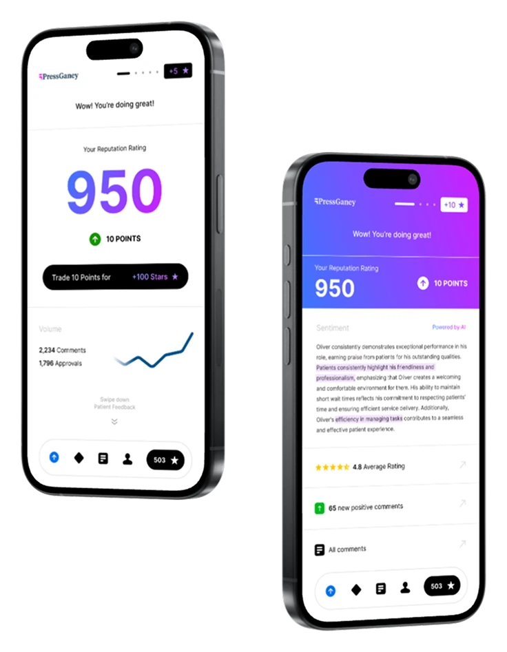
The old review details view crammed everything into a pop-up: the review, its history, categories, and the reply form, all competing for attention. Working with two junior designers, I took it apart and rebuilt it in stages, from gray boxes to a layout that puts the review, the reply, and the task side by side.


Write It For Me
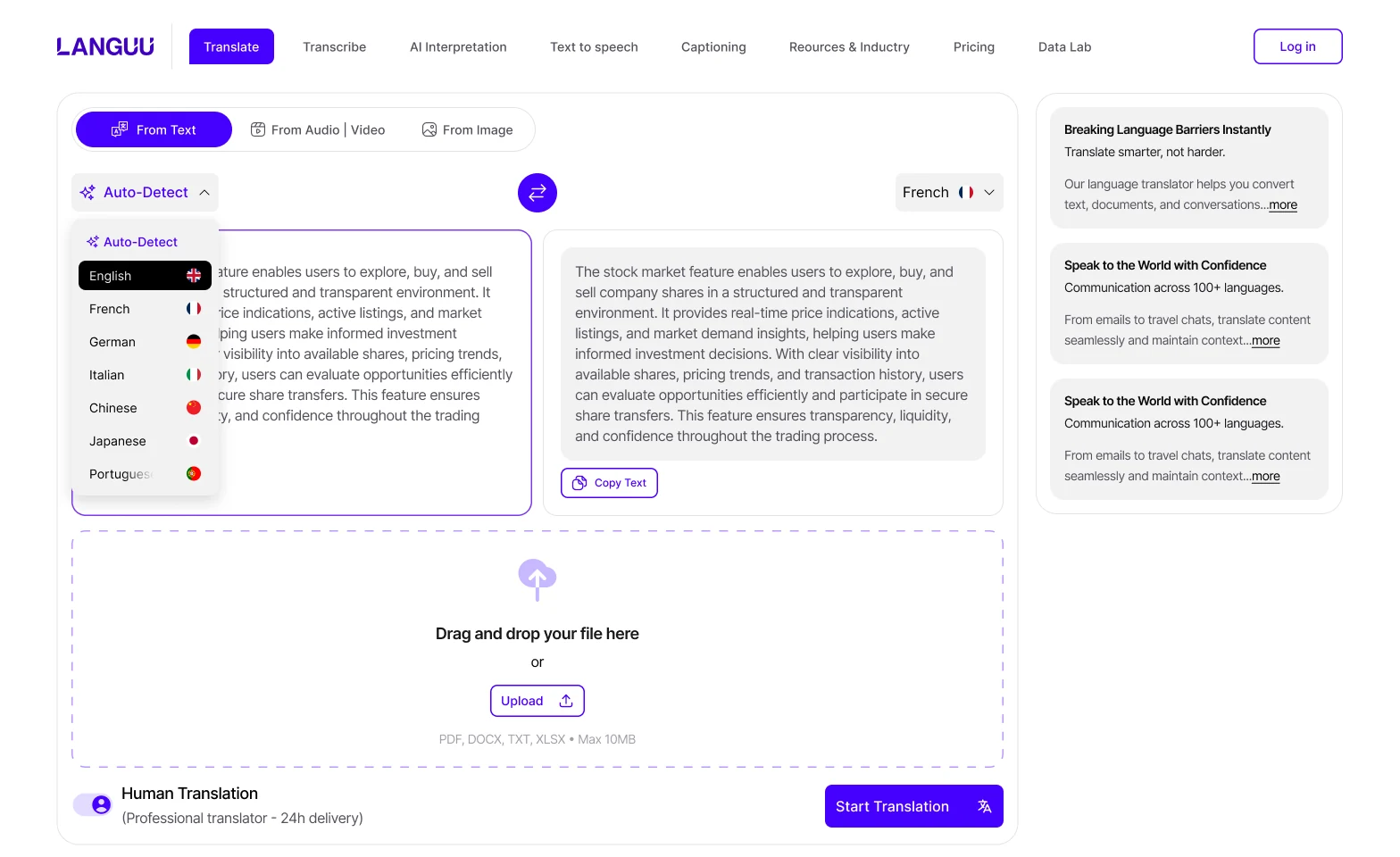
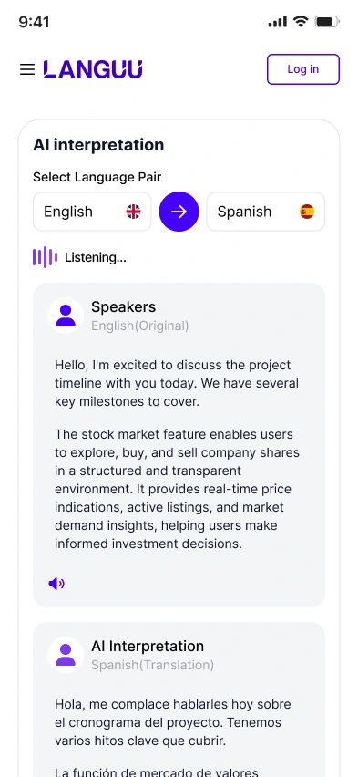
One button, right where the reply starts. It reads the review and drafts a thoughtful response in the health system’s voice. Don’t love it? Try again. Everything stays editable, and nothing goes out until a person presses Send.
The hardest part of replying is starting. So the product starts for you

05 · How we worked
Show something real, early and often
Two weeks to a conference demo, then months to a real release. Stakeholders saw prototypes, wireframes, and mockups at every stage, and brought their own pieces to the table too. Rolling check-ins and quick group chats kept the feedback honest and pointed.
I stay hands-on at every fidelity. It keeps my own skills sharp, and it means the junior designers I support see how decisions get made, not just what got decided. Every design challenge is a growth opportunity, for them and for me.
06 · Snags along the way
Three problems, three design answers
- The AI would be limitedWrite It For Me ran on AnswerAssist, an in-house engine that wouldn't do everything we wanted by launch.Design answerMeet engineering where they are. With the juniors, I mapped the product from a 1.0 to a 5.0, so it could ship small and grow.
- Clients worried about AIThey raised legal, regulatory, and social concerns. In healthcare, that stigma is real.Design answerPut people in charge. The feature can be switched on or off for each user, each client, and the whole platform.
- AI was everywhere, often freeThe product needed enough obvious value to hit sales goals for Reputation and the whole business unit.Design answerGive it a name that says what it does. "Write It For Me" made the value easy to grasp, stood out from the crowd, and gave marketing something to work with.

07 · The result
Faster replies, happier teams
Write It For Me went to the limited-release clients first. Teams using it replied to patients 35% faster and closed 20% more comments, while spending 27% less time in the product to do it. Satisfaction followed: NPS climbed from 3.2 to 4.0 out of 5.
What changed for teams using it
BeforeAfter
35% fasterTime to respond to a patient comment
20% moreComments closed
27% lessTime in the product to finish the job
3.2 → 4.0NPS, on a 1 to 5 scale
First three rows indexed to 100 before launch, limited-release clients
"We're always focused [on] conversion. Reputation is the digital front door. In the 11 months since we partnered with Press Ganey, we saw twice the number of users enter our site, compared to the previous two years, when we had been with the other vendor. It feels like we respond twice as fast to feedback now."
Ashleigh Churchward, Director of Digital Channel Strategy, Northwell Health