Press Ganey
Provider Spotlight
Monthly provider performance report
A monthly report that brings patient feedback straight to doctors' phones, with AI summaries, fair rankings, and a little reward for reading to the end.
- Role
- Senior product designer
- Focus
- Healthcare, Mobile, AI, Engagement
The problem
Doctors were the last to hear what patients said about them, in a dense scorecard nobody looked forward to opening
What I did
Led design of a mobile report with AI summaries, fair tiered rankings, and Stars that reward reading to the end
What changed
A report providers look forward to, open, and share, and a business line customers recommend more
My part
- Led design from research through release
- Designed the report, the ranking tiers, and the Star Exchange
- Partnered with research and engineering to replace the bell curve with fair tiers
- Added every new component to the design system for other teams to reuse
Who I worked with
- Product manager
- Lead researcher
- Product marketing
- iOS, Android, and backend developers
01 · Why it matters
Doctors were the last to hear what patients said
Patients leave feedback everywhere: Google, Yelp, Healthgrades, hospital surveys. It’s some of the most honest information a doctor can get about their care. But doctors don’t have time to log into a platform and dig through it.
So health systems hired staff to read it for them, and pass along what they found. A game of telephone, between the platform, the admins, and the one person who could actually act on it.
The person the feedback was about was the last to see it
02 · Where it started
A spreadsheet, emailed once a month
The old Provider Star Rating Scorecard did its job on paper. Every number was there. But it read like an audit: dense tables, gray bars, and a rank buried in a sentence. Nobody looked forward to opening it.


The goals
- Bring doctors into the loopFeedback only helps if the provider sees it.A report built for the phone in their pocket, not a desktop they never sign into.
- Make complex data simpleRatings, rankings, sentiment, volume: it's a lot.One score, one rank, and a plain-language summary, with the details a tap away.
- Make Press Ganey an allyFeedback can feel like judgment.A report that opens with good news and leaves doctors feeling seen, not graded.
03 · The report
Start with good news
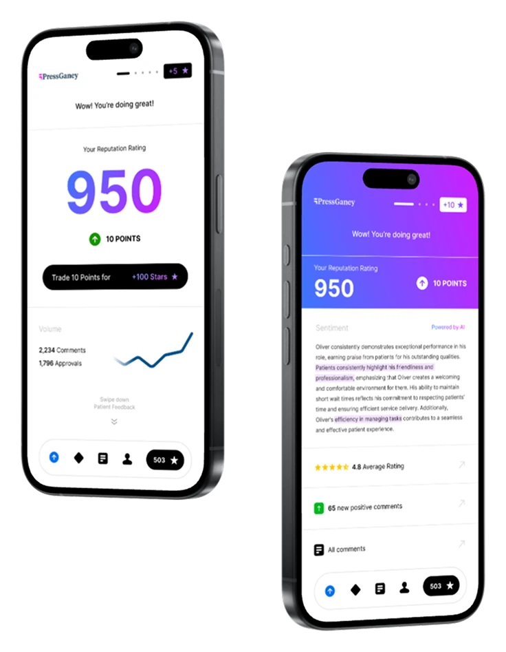
Every report opens with a personal welcome, because a happy doctor is more likely to give great care. Then comes one number that sums up everything: the Reputation Score, with how much it moved since last time.


Thousands of comments, one paragraph
AI reads every comment and writes a short summary in plain English, with the key phrases highlighted. A doctor can understand a month of feedback in the time it takes to wait for an elevator.
Each section of the report is also a doorway: average rating, new positive comments, all comments. Read straight through, or jump to what matters.
Read it all, earn a little something
A progress tracker sits at the top of every page. Finish the report and Stars land in your bank. It’s a small nudge, and it works: almost every provider opens the report, and most read to the end.


04 · Ranking
A rank that feels fair
Research showed that seeing where you stand drives both engagement and a sense of fairness. But traditional rankings grade on a curve, and most people end up feeling average. So the design team worked with engineering to drop the bell curve.
Instead, there are three simple tiers: Excellent, Good, and Opportunity. Each shows how many colleagues are in it, so a rank always comes with context. Managers and providers use it together to talk about growth, promotions, and next steps.

05 · Recognition
Stars worth spending
Stars aren’t just points. In the Star Exchange, providers spend them on real rewards, from gift cards to partner brands. Or they send them to a colleague who had a great month.
Peers recognizing peers turned a report into a culture


06 · The result
Opened, read, and shared
Built to be opened, and read
Old scorecardSpotlight
30% moreProviders using it, compared with the old scorecard
98%Of providers open their report
90%Of clients opted into ranking
Doctors also added 22,000 points to their reputation scores and traded 500,000 Stars along the way. It was built on the existing design system, with about 80% of the components reused. Every new piece, from the score card to the ranking scale, now belongs to the system for other products to use.
In their words
"When I see the Spotlight notification on my phone, it feels like opening the first gift on Christmas morning!"
A physician, 2024