Press Ganey
Doctor.com
Patient-facing provider directory
A forgotten product, inherited through acquisitions, rebuilt into a modern place to find a doctor, and the flagship that shows health systems what their own directory could be.
- Role
- Principal designer
- Focus
- Healthcare, Brand, SEO, Accessibility
The problem
An orphaned product inherited through acquisitions, with a dated brand and a structure search engines couldn't follow
What I did
Rebuilt the brand, search, and profiles, untangled SEO and accessibility with the PM, and used AI to prototype and build
What changed
Google could finally find it, traffic kept climbing after launch, and Sales got a live white-label demo to show health systems
My part
- Led the rebrand and built the design system
- Designed search, filters, and provider profiles
- Defined the page structure for SEO and accessibility
- Used AI to explore directions and turn designs into working code
Who I worked with
- Product manager
- Product strategy and marketing
- AI-assisted development
01 · Why it matters
The front door nobody was minding
Doctor.com came to Press Ganey through a string of acquisitions, and somewhere in the handoffs it got lost. Nobody quite owned it. Nobody quite knew what to do with it.
But people kept showing up. In three months, it pulled 100,000 clicks from Google and another 77,000 from Bing. It’s one of the very few Press Ganey products a regular person can actually use: a place to find a doctor, read real patient reviews, and book.
Patients were still knocking. The house just hadn't been cleaned in years

02 · The idea
Two jobs, one product
The opportunity was bigger than a facelift. Doctor.com could do two things at once.
For patients, it could be a genuinely good way to find the right doctor, practice, or location. For Press Ganey, it could be a flagship. The company sells white-label provider directories to health systems, and there’s no better pitch than a live one. A modern Doctor.com could be the demo, the proof, and the upsell, all at the same URL.
The goals
- Keep what people trustA brand that's been around has equity, even when it looks tired.The teal, the cross mark, and the name stay. Everything around them grows up.
- Help patients choose with confidenceChoosing a doctor is personal and a little scary.Search results and profiles that answer "is this the right person for me?" before the click.
- Sell the white-label storySales needed something to show, not tell.A directory polished enough that a health system can picture its own logo on it.
03 · Exploring
Look wide before going deep
The work started with the industry: how the best health, travel, and booking products make a long list feel personal. Then came directions, a lot of them, fast. AI helped spin up full-page explorations in hours instead of weeks: editorial and bold, dark and premium, bright and friendly, dense and filter-first. Working sessions with product strategy narrowed them down to what fit Doctor.com and what would sell.


04 · The brand
Modern, without starting over
Rebranding something with history is a balancing act. Change too little and it still feels forgotten. Change too much and the people who already trust it stop recognizing it. In healthcare, that recognition is worth a lot, because trust is the whole product.
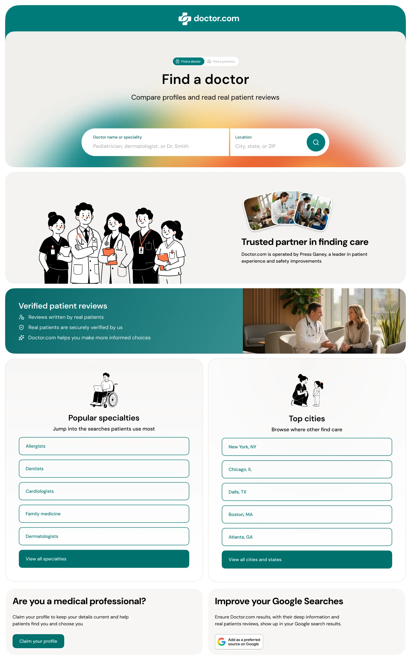
So the brand kept its roots and modernized everything around them. The teal deepened into a confident core color. Orange came in as a warm accent, saved for the moments that matter. DM Sans replaced the dated serif, and a hand-drawn illustration style gave the brand a human voice that stock photos never could.


05 · The product
Search that feels like meeting someone
Results lead with faces, not rows of text. Every card answers the questions patients actually weigh: who is this, what do they treat, where are they, can I book online, and what do other patients think.

Filters stay simple on the surface and deep when you need them. One tap opens a searchable list, and the results update right behind it.

A profile that reads like an introduction
The old profile read like a database entry. The new one starts with the person, then the proof: rating, real reviews, specialties, training, videos, locations, and accepted insurance, in the order a patient asks about them.

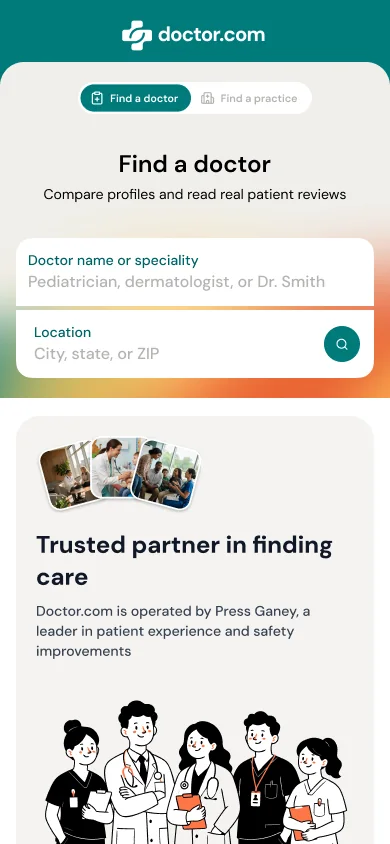
On a phone, the same pieces stack into one easy column, with search up top and the most popular specialties a thumb away.


06 · Findable and usable
Designing for search engines, and for everyone
Doctor.com lives or dies by search. But its SEO story was all over the place: pages that were hard to index, a structure search engines couldn’t follow, and patterns that worked against each other. So design sat down with product strategy, product marketing, and engineering to untangle it.
Design’s job was to make the structure obvious, to people and crawlers alike. A clear hierarchy from home, to providers, to a specialty, to a single doctor. Breadcrumbs on every page that both patients and Google can follow back up. Real headings, real links, and page titles that say what’s on the page.
Accessibility rode along with it, because the two want the same things. Every component got defined states, including a high-contrast focus outline for keyboard users, color pairs checked against contrast standards, and a layout that holds up at any zoom level. When the audience is everyone who needs a doctor, “everyone” has to mean it.

07 · The system
A whole brand, at startup speed
Building a brand from scratch usually means months of tokens, components, and documentation before a single page ships. Here, AI did a lot of the heavy lifting: generating explorations, drafting components and their states, and turning designs into working HTML prototypes engineers could pick up. The design system came together in a fraction of the usual time, and every token is ready to be reskinned for a health system’s own brand.
The demo became the pitch: here's what your directory could be
08 · The result
A flagship again
Doctor.com went from an orphaned acquisition to the product Press Ganey leads with, and the search cleanup paid off. Over three months, the site earned 10.1 million impressions and 138,000 clicks from Google, up from about 100,000 clicks before. When the new design went live in late August, daily clicks roughly doubled and impressions climbed about fivefold.
Search, before and after the new site
BeforeAfter
138KClicks from Google over three months, up from about 100K
2×Daily clicks after the new design went live
~5×Daily search impressions after launch
Source: Google Search Console, late May to late August 2026

Patients get a modern way to find care. Sales gets a living demo of the white-label directory, and it quickly became a regular part of conversations with health systems, opening the door to upsells along the way.
Same name, same teal. Twice the people finding it